Redmi Watch 4, the latest addition to Xiaomi’s impressive lineup of wearable technology, offers users a multitude of customization options to tailor their experience according to their preferences.
Among its array of features is the ability to switch between grid and list layout for the main menu, providing users with flexibility in how they navigate through apps and features.
In this article, we’ll delve into the simple steps to switch between these layouts effortlessly. Before we dive into the process of switching between grid and list layouts on the Redmi Watch 4, let’s briefly understand what each layout entails:
Grid Layout: In the grid layout, apps and features are displayed in a grid-like fashion, allowing for quick access to various functions with a glance. This layout is ideal for users who prefer a visually appealing and intuitive interface.
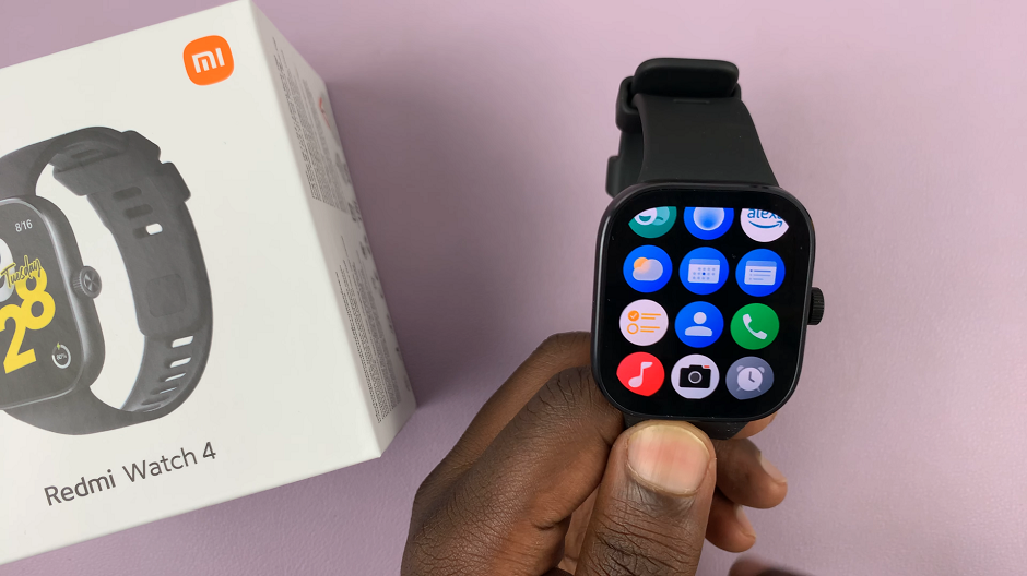
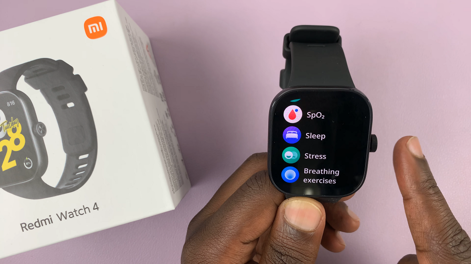
List Layout: Conversely, the list layout presents apps and features in a vertical list format, offering a more organized and streamlined approach to navigation. Users who prioritize simplicity and ease of scrolling may find this layout more suitable for their needs.
Read: How To ‘Find My Phone’ Using Redmi Watch 4
Switch Main Menu Layout On Redmi Watch 4
To start, press the crown on your Redmi Watch 4 to access the apps menu. Here, scroll through until you find the Settings icon. It is represented by a cog wheel icon. Tap on it to access the settings menu.
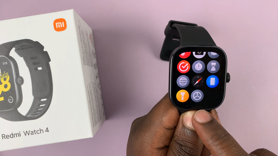
You can also access the settings menu via the quick settings. Simply swipe upwards from the watch face and tap on the icon that resembles a nut bolt.
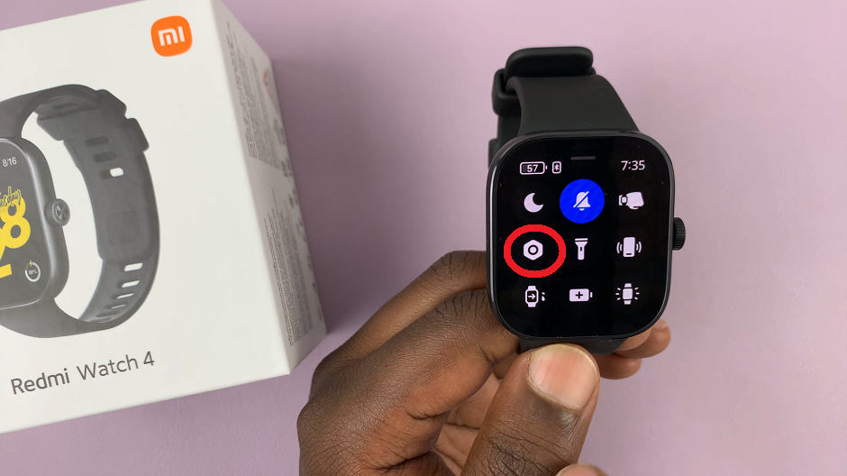
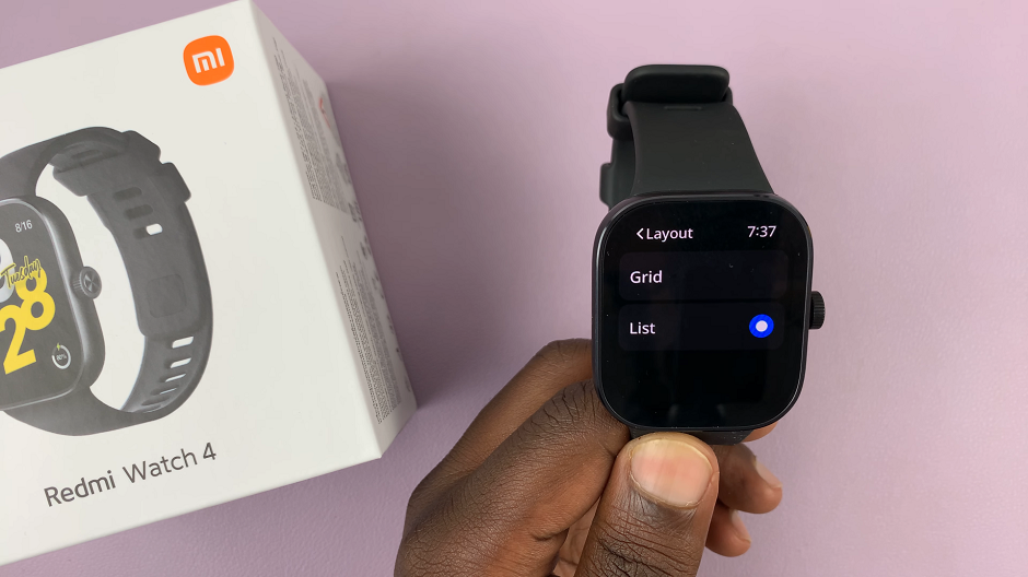
Next, scroll down until you find the Layout option. Tap on it to open these settings. Then, you will see options labeled Grid & List.
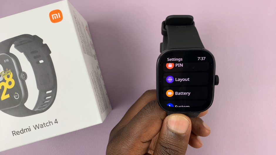
Depending on which option is currently active, select the other option, if it’s the one you want. This will switch the main menu to what you select.
Once the changes are saved, navigate back to the main menu to see the changes. You should now see the apps or functions listed in the layout you chose.
Customizing the main menu layout on your Redmi Watch 4 is a simple yet effective way to enhance your user experience and tailor the device to suit your individual preferences. Whether you prefer the visual appeal of a grid layout or the streamlined organization of a list layout, the Redmi Watch 4 offers the flexibility to switch between these options with ease.
By following the straightforward steps outlined in this article, you can seamlessly transition between grid and list layouts to optimize your navigation experience on the Redmi Watch 4. Experiment with both layouts to determine which one best suits your needs and preferences, and enjoy a personalized and intuitive user experience with your Redmi Watch 4.
Watch: How To Stop Instagram From Sharing Your Stories To Facebook
